Creating a Sunburst Chart
Always Looking for that Golden (Interactive) Sun on the SwiftUI Horizon
There’s nothing quite like sitting on your boat, legs up, pina colada in hand. Nothing but blue water all around you. Just over on the horizon… not one, but two SectorMark charts making up a beautiful Sunburst Chart. Ah, life is good!
In all seriousness, Swift Charts are a lot of fun to work/play with. For developers, it does a really good job of allowing data to be displayed in a number of ways, with a number of style options, and all with the declarative/reactive nature of SwiftUI. For users, charts can be really useful tools to learn about, understand, and interact with data.
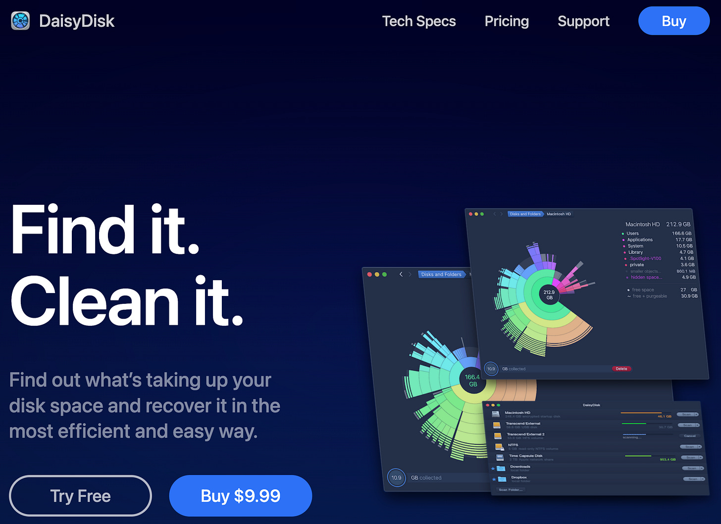
One such app that utilizes a strong, interactive chart at the core of its UX is DaisyDisk. After scanning your machine and looking at all its data and directories, it categorizes and then visualizes what’s stored. They use what’s called a Sunburst Chart to show multi-layered donut charts, allowing you to go deeper and deeper into a category to understand your storage situation. (I swear this isn’t an ad or paid promotion).

Feeling inspired, I saw an opportunity to try something new with Charts and see if I could make a Sunburst Chart myself. And that’s what we’ll dive into in this post, exploring how to take Charts and use them for some “outside of the framework box” fun!
Disclaimer: I didn’t get nearly anywhere as detailed as DaisyDisk, but I had fun nailing the basic concept. To learn more about the complexities and improvements made since its inception, you can read up on the History of Sunburst Visualization from the DaisyDisk docs, themselves.
Setting Up Data
I find the best place to start playing with a chart is to have some mock data on hand to play with, even if it’s simple and needs to be enhanced later on. For this exercise, we’ll pretend we’re checking out what’s in stock at a local grocery market.
struct MarketData: Identifiable, Hashable {
    var id = UUID()
    let name: String
    let total: Double
    let type: MarketType
    let children: [MarketData]
}

enum MarketType {
    case fruit
    case vegetable
    case meat
    case other
}

let mockData: [MarketData] = [
    .init(name: "Fruits", total: 63000.0, type: .fruit, children: [
        .init(name: "Apple", total: 40000.0, type: .fruit, children: []),
        .init(name: "Orange", total: 15000.0, type: .fruit, children: []),
        .init(name: "Grapes", total: 5000.0, type: .fruit, children: []),
        .init(name: "Bananas", total: 3000.0, type: .fruit, children: [])
    ]),
    .init(name: "Vegetables", total: 25000.0, type: .vegetable, children: [
        .init(name: "Zucchini", total: 17000.0, type: .vegetable, children: []),
        .init(name: "Spinach", total: 8000.0, type: .vegetable, children: [])
    ]),
    .init(name: "Meats", total: 7000.0, type: .meat, children: [
        .init(name: "Beef", total: 5000.0, type: .meat, children: []),
        .init(name: "Chicken", total: 2000.0, type: .meat, children: [])
    ]),
    .init(name: "Other", total: 30000.0, type: .other, children: [
        .init(name: "Pirate's Booty", total: 30000.0, type: .other, children: [])
    ])
]
You’ll see that we use a pretty basic type and that we allow each object to contain an array of children. This will help us understand the data and the relationships across layers.
Ring 1
Now to build our charts.
To have an idea of where we’re headed, the secret sauce is that we’ll be creating multiple SectorMark charts contained in a ZStack. That’s correct, SwiftUI almost trivializes the entire process with just a simple Stack.
Let’s begin with the following code snippet. Bear with me, the properties will make sense as we go on, and the long if/else is just so that we have Text in place to test our chart:
import SwiftUI
import Charts

struct SunburstChart: View {
    let chartWidth: CGFloat = 175

    @State var selectedTotal1: Double?
    @State var selectedSegment1: MarketData?

    @State var selectedTotal2: Double?
    @State var selectedSegment2: MarketData?

    var body: some View {
        VStack {
            if let selectedSegment1 {
                Text(selectedSegment1.name)
                    .font(.title)
                Text("$\(selectedSegment1.total.formatted())")
                    .font(.title3)
            } else if let selectedSegment2 {
                Text(selectedSegment2.name)
                    .font(.title)
                Text("$\(selectedSegment2.total.formatted())")
                    .font(.title3)
            } else {
                Text("Welcome to Our Market!")
                    .font(.title)
                Text("Select a segment...")
                    .font(.title3)
            }

            // THIS IS WHERE WE'LL BE BUILDING OUR CHART
            ZStack { ...}
        }
    }
With this in place, let’s add the inner circle to the ZStack:
Chart(mockData){ item in
    SectorMark(angle: .value("Total", item.total),
               innerRadius: .ratio(0.5),
               angularInset: 1.5)
    .foregroundStyle(colorFor(type: item.type)
        .opacity(selectOpacity(markID: item.id, selectID: selectedSegment1?.id)))
}
.frame(width: chartWidth, height: chartWidth)
.chartAngleSelection(value: $selectedTotal1)
Note: Many of the hard coded values were after some trial and error, ultimately settling on what I thought looked best. They are not fixed and open to your preference. As for colorFor and selectOpacity, these are custom helper functions. I’ll share them at the bottom of this post. They’re not critical to the task at hand, so as to not clutter I’ve moved them down there.
The Charts framework really does make it as simple as declaring a Chart with our data source, declaring the SectorMark type and assigning our total property, and from there styling.
The result looks like this:
Getting the Sector
The modifier of note here is chartAngleSelection. This will be how we determine the current selected segment. However, what this returns is the actual value out of the total value of the chart. Essentially, the grand total of all the item.total values that were plotted out and drawn.
To determine the sector, let’s create a helper function that determines the sector based on the returned selected value:
private func findSelectedSector(value: Double, in data: [MarketData]) -> MarketData? {
    var accumulatedCount: Double = 0

    let sector = data.first { item in
        accumulatedCount += item.total
        return value <= accumulatedCount
    }

    return sector
}
The function uses first to traverse the sectors in our data. As it does, it keeps track of the accumulated totals. As soon as the selected angle value falls within range of the accumulation, we’ve found our sector.
We can track the calculated selected sector, then, by adding one more modifier to our chart so that, as we get a selectedTotal, we can reactively calculate the sector and set it to selectedSegment:
.onChange(of: selectedTotal1) { _, newValue in
    // Future-proofing clearing of states
    selectedSegment2 = nil

    if let newValue {
        selectedSegment1 = findSelectedSector(value: newValue, in: mockData)
    } else {
        selectedSegment1 = nil
    }
}
Because we already have Text components setup to react to changes, as well, we can now test selecting segments:
So far, we’ve built the mock data, the infrastructure for our Sunburst, and now the first ring. We also have State properties tracking any selection that may be occurring, both as a total value and the sector, itself.
Now let’s “burst” out Ring 2.
Ring 2
The first thing we need to do is determine the data for Ring 2. We can do this by mapping out the first generation children of our mock data:
func getRing() -> [MarketData] {
    let allChildren = mockData.map { $0.children }
    return allChildren.flatMap { $0 }
}
The next step is almost too easy. We copy Ring 1 and paste right above it, still within the ZStack. Next, create our outerRing data and plug it into the chart. Lastly, we adjust the properties and parameter values to apply for the second chart. To make it easier, follow the bolded code:
let outerRing = getRing()
Chart(outerRing){ item in
    SectorMark(angle: .value("Total", item.total),
               innerRadius: .ratio(0.6),
               outerRadius: .ratio(0.9),
               angularInset: 1.5)
    .foregroundStyle(colorFor(type: item.type)
        .opacity(selectOpacity(markID: item.id, selectID: selectedSegment2?.id, ring: 2)))
}
.frame(width: chartWidth * 2, height: chartWidth * 2)
.chartAngleSelection(value: $selectedTotal2)
.onChange(of: selectedTotal2) { _, newValue in
    selectedSegment1 = nil
    if let newValue {
        selectedSegment2 = findSelectedSector(value: newValue, in: outerRing)
    } else {
        selectedSegment2 = nil
    }
}
That’s it! Now if we test out our app:
Conclusion
And there we have it, a basic Sunburst Chart! This was a rather elementary example, admittedly. However, I’d like to highlight a few things:
Creating an enhanced or unique experience does not always need to be incredibly complex. Sometimes it’s as simple as Stacks and Command+C/V.
SwiftUI’s declarative nature allowed the process to be simple. We merely copy/pasted and edited values and properties directly in line. Such a relief from IB and Storyboards.
The selection logic (including
chartAngleSelectionandonChange(per chart) andfindSelectedSector) are a total 29 lines of code (that’s including blank lines and curly bracket lines). A mind-boggling low lines of code for such a cool interaction for users.
Future work would be to make this more scaleable and reusable. But for now, back to the boat, colada in hand, marveling over our work as we sunset another post for now.
Code and Helper Functions
Code can be found here.
And as promised above, here are some of the helper functions used:
func colorFor(type: MarketType) -> Color {
    switch type {
    case .fruit:
        return Color.yellow
    case .vegetable:
        return Color.red
    case .meat:
        return Color.blue
    case .other:
        return Color.green
    }
}

func selectOpacity(markID: UUID, selectID: UUID?, ring: Int = 1) -> CGFloat {
    if let selectID {
        if selectID == markID {
            return 1.0
        }
    }
    return ring == 1 ? 0.8 : 0.55
}


