

Expanding App Options on macOS
Leveraging One of macOS's Most Distinctive Features with SwiftUI

Despite phones and tablets cementing their places in our technological lives, personal computers remain essential, especially in the professional workspace. For SwiftUI developers, macOS is crucial for coding apps without limitations.
Learning macOS development has its benefits, and SwiftUI makes the transition easier for those familiar with iOS/iPadOS development. However, understanding the differences with macOS is key. To name a few:
User input primarily relies on peripherals.
Windows can vary in size and number
The system toolbar provides customizable options for your app.
This post will focus on the latter. The system toolbar has been a fixture of macOS for decades, and most users are familiar with it. It’s an extension of the focused app as well as the user's entire system.
Together we’ll explore the options on the macOS system toolbar specifically through SwiftUI, equipping you on how to enhance the user experience of your app with tailored options and actions.
Settings

The simplest example is the “Settings” command found when you tap on the app name on the toolbar. Apps take advantage of a Settings window to have a centralized, yet simplified GUI to set specific preferences and conditions that affect the main user experience in the app, itself.
For users, it’s a familiar and expected place to customize their experience.
Fortunately, creating and setting the Settings GUI is incredibly simple in SwiftUI. In your app’s App, alongside any Windows or WindowGroups, you can add Settings:
@main
struct AppOptionsApp: App {
    var body: some Scene {
        WindowGroup {
            ContentView()
        }

        // Add Settings here
        Settings {
            Text("Welcome to the Settings!")
                .padding()
        }
    }
}
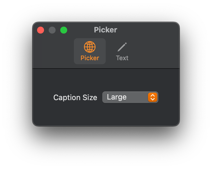
From there, it’s a matter of building out a UI with components that display selected options and allows users to change them. For an example, a Picker to set the general font size in the main experience:
Settings {
	Picker("Caption Size", selection: $mainFontSize) {
		Text("Large").tag(0)
		Text("Medium").tag(1)
		Text("Small").tag(2)
	}
	.padding()
}
If we have a number of settings and options that can fall under categories, they can be organized using TabView:
Settings {
    TabView {
        Picker("Caption Size", selection: $mainFontSize) {
            Text("Large").tag(0)
            Text("Medium").tag(1)
            Text("Small").tag(2)
        }
        .padding()
        .tabItem {
            Label("Picker", systemImage: "globe")
        }

        Text("Welcome to the Settings!")
            .padding()
            .tabItem {
                Label("Text", systemImage: "pencil")
            }
    }
    .scenePadding()
    .frame(maxWidth: 350, minHeight: 100)
}
The declarative prowess of SwiftUI makes it easy to quickly build and scale our app Settings.
Persisting User Preferences using @AppStorage
Once a user makes their selections, it’s important for a) those selections to make their way into our main app experience and b) that we save those preferences so that users don’t have to reset them manually every time.
The simplest way is to use @AppStorage (for seasoned devs, this taps into UserDefaults). With this property wrapper, we can store basic preferences associated with our app, and then summon them on demand. Even better, they are observable, which means that we can have changes to a preference take effect immediately if the experience allows for it.
In our example with font sizes above, we store the user preference with:
@AppStorage("mainFontSize") var mainFontSize: Int = 0In the experience, itself, we make the same call to gain access to and observe the stored preference. That’s it!
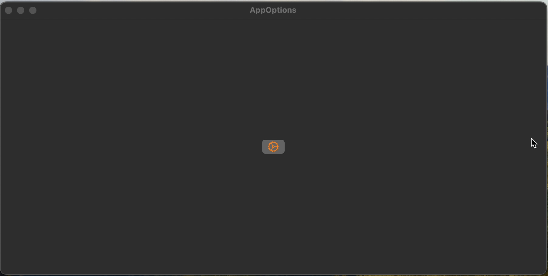
SettingsLink
If we want to bring up the Settings from somewhere other than the menu bar, we can add a SettingsLink. This will automatically open the settings window, but with a customized component for users to access it from:
SettingsLink {
    Image(systemName: "gear")
        .font(.largeTitle)
}
Commands
We just went through how to create a custom Settings experience. But what if we want to customize the toolbar commands even further? Using the .commands modifier, we can take over and edit the toolbar in significant ways.
Add a Menu
The easiest option is adding a new menu to the toolbar:
WindowGroup {
    ContentView()
}
.commands {
    CommandMenu("My Commandment") {
        Button("Thou shalt...") {
            print("...love SwiftUI")
        }
        .keyboardShortcut("t")
    }
}
Which ends up looking like:

Editing Commands
There are default commands that come with an app, such as About. There are a few ways to edit these, such as commandsRemoved() and commandsReplaced(content:). These are perfect for when you want to fine tune the options your users see and have available to them.
MenuBarExtra
There’s one more option to consider, and it’s also the coolest, in my opinion. We can use MenuBarExtra to add an icon on the right side of the toolbar.
That’s right, as if to have been granted into the Halls of Iconographic Menu Valhalla, itself, there our apps can also co-exist.
The power of this menu surpasses those of the commands we mentioned before in two specific ways:
The icon and it’s functionality is present and accessible even when our app is not focused on.
The menu could look like a drop-down list… or it could carry custom UX (e.g. the system Mission Control)
Using MenuBarExtra is as simple as it is to use Settings, but from there can grow more robust and complex. In fact, you can, with a few extra changes to your project settings, make an app that’s exclusive to the Menu Bar!
We’ll get into the more advanced stuff in another post, but for now, we can do something like this:

With as little code as this:
MenuBarExtra("Extra!", systemImage: "newspaper") {
    Text("Read all about it!")
}
Setting a New Course for Your App
The cool thing about all these options is that they allow you to break free from the constraints of the Window in your app. As a macOS developer, you can now provide more options, functionality, visibility and ease to your user’s experience without having to include it in the UI of your app. This is a key distinguishing feature from iOS and iPadOS development, providing a more professional, productivity-oriented feel.