Not long ago, I took part in a healthy debate: Should an experience use SwiftUI’s built-in Form, or roll its own custom-styled container?
One camp argued in favor of Form, emphasizing that it follows Apple’s Human Interface Guidelines (HIG) by default. They believed that even if Apple updated its appearance in the future, sticking with Form would help us stay aligned with native platform conventions. Others weren’t so convinced — they wanted full control over styling, worried that relying on Form might lock us into a brittle or inflexible design path.
Captain SwiftUI is a reader-supported publication. To receive new posts and support my work, consider becoming a free or paid subscriber.
As we explored both sides, something became clear: this wasn’t just a styling choice. It was an architectural and design philosophy decision. So in this article, we’re going to explore what Form actually does, why you might (or might not) want to use it, and what it really means to build a “form” in SwiftUI.
What Form Actually Does
At its core, Form is just a container view— a specialized type of stylized List that Apple maintains and updates.
Wrapping your views in a Form applies platform-specific styling:
On iOS, you get grouped rows, padding, and label alignment.
On macOS or visionOS, Form adapts to each platform’s standard form behavior.
In many cases, it will also group toggles, pickers, and text fields with proper accessibility behavior and spacing.
Form follows the Human Interface Guidelines (HIG) out of the box, making it easy to build views that "look right" without customizing spacing or alignment manually.
Wait — what about FormStyle?
SwiftUI does allow you to define a custom FormStyle. But after exploring that path, I found that creating a custom FormStyle feels nearly identical to just building your own container with a VStack, ScrollView, or even a custom Layout. You might gain some semantic clarity — e.g. denoting that “this block of UI is a form” — but in practice, you still need to handle layout and appearance yourself.
Experiment: Comparing a Custom FormStyle vs Custom Container
I created a quick little experiment. I made a ridiculous custom FormStyle:
struct CustomFormStyle: FormStyle {
    @MainActor @preconcurrency public func makeBody(configuration: CustomFormStyle.Configuration) -> some View {
        ForEach(sections: configuration.content) { section in
            VStack {
                section.header
                    .font(.title)
                    .foregroundStyle(.purple)
                ForEach(subviews: section.content) { subview in
                    subview
                        .foregroundStyle(.pink)
                }
                section.footer
            }
            .background(Color.red)
        }
    }
}

extension FormStyle where Self == CustomFormStyle {
    @MainActor @preconcurrency internal static var custom: CustomFormStyle {
        .init()
    }
}
I then created a custom container… with essentially the same code:
struct CustomContainer<Content: View>: View {
    var content: Content

    var body: some View {
        ForEach(sections: content) { section in
            VStack {
                section.header
                    .font(.title)
                    .foregroundStyle(.purple)
                ForEach(subviews: section.content) { subview in
                    subview
                        .foregroundStyle(.pink)
                }
                section.footer
            }
            .background(Color.red)
        }
    }
}
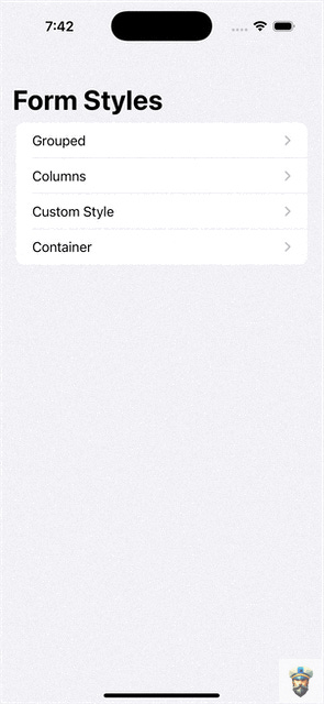
The result was that both custom implementations looked exactly the same, while using Grouped or Columns styles looked as expected:
In short: Form is a pre-styled container. Nothing more. If you don’t like Apple’s design decisions for forms, you may be better off just making your own.
Join us June 19 @ 11am EDT for a special Office Hours: Post-WWDC Edition!
We’ll be talking all about the WWDC goodies Apple brings this year and what they could mean for us devs! Join the Captain’s Crew as a Paid Subscriber to get access!
There’s a reason Apple made Form in the first place: it streamlines a lot of common UI work and keeps your app aligned with system conventions.
Here are some good reasons to use it:
✅ Adheres to HIG automatically You get consistent spacing, font sizes, and affordances with almost no effort.
✅ Future-proofing If Apple updates Form’s design in a future OS version, your views adapt for free — no manual restyling required.
✅ Less UI boilerplate You don’t need to micromanage padding or alignment across multiple sections and controls.
✅ Accessibility baked in Screen readers understand how to navigate grouped controls in a Form, and focus behavior is handled for you.
✅ Easy integration with system controls Pickers, toggles, and steppers drop in with ideal spacing and behavior.
For many apps — especially settings pages or profile screens — these defaults are exactly what you want.
The Case Against Using Form
Despite its convenience, Form also comes with tradeoffs — especially for teams with strong design systems or highly customized layouts.
Some common drawbacks:
❌ Limited styling flexibility If you want custom fonts, backgrounds, insets, or separators, you’ll find yourself fighting against Form’s default styling.
❌ Inconsistent behavior across platforms and OS versions What looks great on iOS 17 may feel odd on macOS or completely different on visionOS.
❌ Difficult to theme or brand Customizing Form to match your app’s unique look often involves painful workarounds.
❌ Hidden structure Because Form is backed by List, things like section spacing and background bleed may be controlled behind the scenes.
❌ You're locked into Apple’s opinion If you don’t agree with the HIG’s take on forms, you're essentially styling against the current.
And, as I found while exploring FormStyle, the moment you start trying to "override" too much, you’re essentially re-implementing a container. At that point, it may be simpler — and more sustainable — to just write your own.
A Middle Path?
Here’s the good news: this isn’t an either/or situation.
You can — and maybe should — use both approaches depending on context:
Use Form for data entry views where HIG compliance is a benefit (e.g. settings, registration, feedback).
Use custom containers for marketing-heavy or brand-driven forms that require pixel-perfect control.
Consider wrapping fields in your own styled components like FormSection, FormField, or FormGroup, which provide the structure of a form without relying on Form itself.
Ultimately, this is a design system decision, not just a SwiftUI one. If your team values native alignment, Form is a gift. If you’re chasing precision and consistency across platforms, rolling your own container might be the better path.
Final Thoughts
SwiftUI’s Form isn’t magic — it’s just a container Apple maintains and styles for what it considers “form-like” interactions. And that’s not a bad thing. But it also means that if you disagree with Apple’s styling, you’re probably not looking to tweak Form — you’re looking to replace it.
My advice? Don’t fear the Form. But don’t treat it as sacred either. Know what it gives you, and what it costs.Then decide what’s best for your team and your users.
Happy forming.
Captain SwiftUI is a reader-supported publication. To receive new posts and support my work, consider becoming a free or paid subscriber.


I agree, I recently used Form for a Mac app preference pane, it made it look perfectly aligned with Apple’s HIG.