

Keeping Score with Liquid Glass & TabView Bottom Accessory
Putting this year's new feature's up to bat with the new Liquid Glass TabView

This year's WWDC has really got me thinking about what's next for Apple development. Liquid Glass ushers in a new era of mobile design and, with it, some really radical UX perspective shifts. SwiftUI has matured to a point where (alongside a redesign) the primary focus feels like its shifted in supporting and improving performance. And then there's Foundational Models, introducing on-device intelligence to both the consumer and developer masses.
While I've been enjoying watching the sessions... I needed to get my hands dirty. So I downloaded Xcode 26, (accidentally) installed macOS Tahoe on my personal machine, and got to work creating a base iOS app that will be my testing grounds of sorts. Probably for the next few articles.
For this starter article, we'll try using Xcode 26's new AI tools and Liquid Glass's new TabView. And let me tell you... I think Apple knocked it out of the park with these.
Starting Line-up: Creating a Demo MLB App
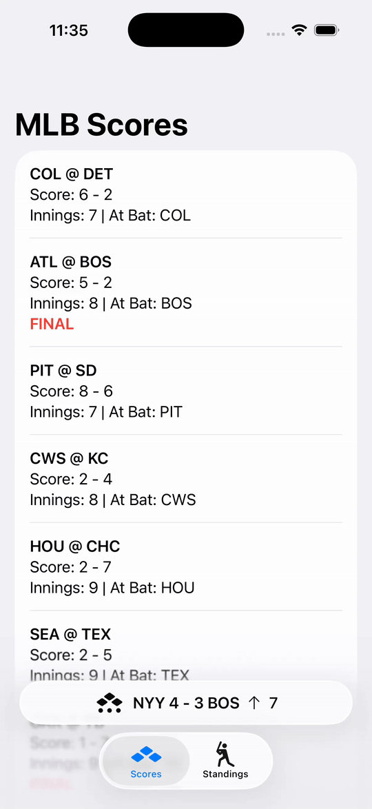
To test things out, I built a simple (mocked out) baseball scores app. A TabView will drive out two main pages: scores and standings. Scores will simple list out games and there scores while standings will list out team standings based on League and Division.
This will give us an opportunity to experiment with the new Liquid Glass TabView. I'm extremely curious about how much real-estate we're really gaining by the glass look and floating design, plus the new minimizing behaviors we can apply. To make it even more worthwhile, there'll also be the new bottom accessory to the TabView that will show the score of a "live" game.
Play ball!
That's already a tall order and I didn't want to take up too much time away from watching sessions. Therefore, I enlisted the new intelligence features in Xcode 26 to help build the base of the app.
I opened the chat window and explained the two main views and asked for the data models I would need. I then asked it to create basic UI's for both based on the descriptions I gave earlier. The results were not too shabby:

You can see that the TabView is no longer a bar but the floating dock we’ve seen in visionOS. You also can tell that, while you can see the List behind the tabs, there’s a frosted look obscuring the details.
For the sake of focusing this article on the new things, I'm not gonna post the snippets for the stuff up to this point. But, if you are curious, you can view the code on Github.
Scouter's Eye: Creating a Live Score Accessory
Imagine your checking the days scores and standings but there's a game going on right now and you wanna stay on top of it's progress. The new TabView Bottom Accessory honestly feels like a perfect use of this feature.
Now, remember, I'm just playing with mock/static data, but I created a super simple View that has a baseball indicator symbol, the abbreviations and scores for both teams, and what inning it is. Enough to track what's going on.
.tabViewBottomAccessory {
    HStack {
        Image(systemName: "baseball.diamond.bases.outs.indicator")
        Text("\(MLBTeam.yankees.abbreviation) 4 - 3 \(MLBTeam.redSox.abbreviation)")
            .bold()
        Image(systemName: "arrow.up")
            .font(.caption)
        Text("7")
    }
}
The result looked great:

Then I took it a step further by adding .tabBarMinimizeBehavior(.onScrollDown). And boy did I really, really like the results:
I love this new accessory plus minimize behavior! That is just one of the coolest things I've seen this year from WWDC. The accessory, itself, is minimalist, yet informative while persisting across tabs (notice in the GIF that I switch tabs and the accessory stays in place). It can easily be swapped out for different views (either by user choice or based on some context) and can be made tappable by placing a button or gesture.
To me, it sets a hopeful tone about what Liquid Glass could be trying to achieve. Let me explain.
Approaching the Mound
Think about it: The TabView literally eats up a portion of your screen's real estate displaying the same icons and text almost permanently. When you think about it, it's such an incredibly dead waste of space just to ensure a basic navigation. Yes, we could have added Badges, but the View has remained mostly unaltered for ages.
Just enabling the new minimizing behavior (without an accessory) is nice as it neatly folds and packs the tabs to the bottom corner, though it leaves a frosty covering in it's wake:

What takes this to a whole new level is that by enabling minimizing with an accessory, the tabs fold into that corner and the accessory then glides in to the now open space. Not only does this return back the space the accessory took above the TabView, but it makes the TabView space actually useful for more than just Tab Navigation!
On Deck: Summaries with Foundation Models
The next feature I want to test out is Foundation Models. I'd like to see how quickly I can get prompts and responses setup, so in my next article I'll create features that will summarize the list of scores and the current standings. Simple, but enough to lightly test how quickly we can add basic on-device AI features into our app (no networking, accounts, or web API's necessary). I also hope to use the new #Playground macro to test out my prompts in the IDE instead of re-running every time.
Looking forward to taking this demo app to the Big Leagues with you all!
Source code for this article can be found on Github.
Looking to Talk More WWDC? Join Office Hours on June 19th!
Looking to talk more about WWDC25 and all the other goodies we got this year? Ready to vent about and/or praise Liquid Glass? Wanna ask how I tested some of these things? We’ll talk about it all!
Join as a Paid Subscriber on July 19th at 11:00 am EDT! If you aren’t a member already, consider joining with a special discounted rate!
Thanks! I'm exploring what it's coming with Liquid Glass and something I notice is that with the minimize variant the content of the accessory is shifted to the top cropping it (You will see it clear if you set a background color to your HStack in the accessory ). Do you know if this is a bug?
Thanks for sharing. Would be interesting to see how UITabBarController with UIKit-base app will look. Non plain list and tinted tabbar items might be broken (