

Playing with Sheet (on iOS)
A look at how Apple has reshaped modal and sheet presentations in SwiftUI for iOS

There’s been ongoing—yet significant—evolution in how sheets and modals are used. The era of full-screen takeovers and heavy modals has been fading, replaced by lightweight, flexible, and fluid overlays that feel right at home in the new Liquid Glass design system.
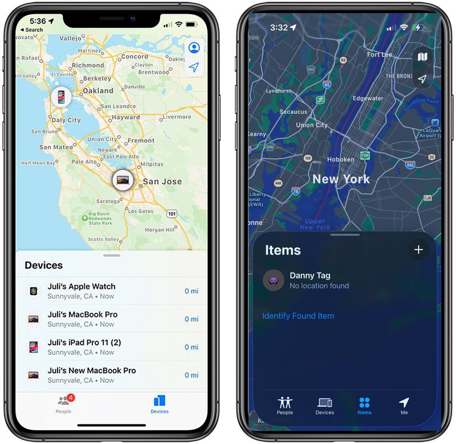
Apple’s been steadily modernizing the way we present content—most notably through presentation detents, component roles, and a refreshed set of presentation modifiers that give developers real control over look, feel, and motion. Even the elusive and slightly odd TabView/sheet pattern from “Find My” has been cleaned up, aligning with the system’s new aesthetic.
In this article, I wanted to take a break from the broader, high-level topics and just have some fun playing with sheet—exploring what’s new, what’s changing, and how you can adopt Apple’s updated presentation model in SwiftUI without losing your sense of flow.
Sheet Fundamentals and Modern Presentation
For years, a “sheet” in SwiftUI meant one thing: a full-screen takeover that slid up from the bottom, blocked everything behind it, and waited for the user to tap a “Done” button before giving control back. It got the job done — but it also froze the rest of the experience.
That era has long sailed away.
Today, sheets are far more flexible. They’re not just interruptions — they can be the moment, or complement it. A sheet can act as a full-screen view, a compact accessory, a sliding control panel, or a lightweight status overlay. What used to be a rigid, single-purpose UI element has evolved into one of the most dynamic tools in the developer’s toolkit.
Apple’s presentation modifiers — like .presentationDetents, .presentationCornerRadius, and .presentationBackgroundInteraction — capture that evolution. These aren’t just cosmetic flourishes; they represent a philosophical shift: a sheet no longer removes users from context — it expands it.
Here’s a simple example that captures that spirit:
.sheet(isPresented: $showSettings) {
    SettingsView()
        .presentationDetents([.medium, .large])
        .presentationBackgroundInteraction(.enabled)
        .presentationCornerRadius(32)
}
What used to be a hard stop is now a conversation between layers. The user decides how much space they need; you decide how immersive it should feel.
That’s the foundation of modern sheet design: adaptive, responsive, and gracefully contextual.
Captain’s Tip
If it feels like you’re breaking flow, you probably are. In the Liquid Glass era, sheets should move like water — flowing with the user’s intent, not against it.
Understanding Detents — Designing in Depth
When sheets first landed in SwiftUI, they were pretty basic — useful, but blunt. You could show a modal that covered most of the screen or one that hovered partway up, and that was about it.
With presentation detents, Apple has turned sheets into a flexible, fluid part of the user experience. They can live anywhere between a full takeover and a subtle overlay — floating, snapping, or expanding based on user intent and your app’s design.
Think of detents as waypoints for your sheet — positions that define how much space the sheet occupies, how it behaves when dragged, and how the user transitions between states.
The Built-Ins: Medium and Large
The simplest detents are built right in: .medium and .large. These match Apple’s own design language — you’ll find them everywhere from Maps to Stocks.
A .medium detent is great for contextual views — showing filters, lists, or a now-playing interface. A .large detent, meanwhile, is perfect for tasks that need focus but don’t necessarily deserve a new screen.
Going Custom — Height and Fraction
Sometimes your sheet doesn’t fit neatly into Apple’s presets. That’s where custom detents come in:
.presentationDetents([
    .fraction(0.25),
    .medium,
    .height(500)
])
Here, you’re defining specific heights or proportional space allocations, giving your sheet a feel that matches your content.
Fractional heights like .fraction(0.25) are particularly useful when you want consistency across devices, while .height() gives you fine-grained control for precise layouts.
For custom, reusable, and labeled detents, you can also take advantage of CustomPresentationDetent to define and set your own detents:
private struct ScoreOnly: CustomPresentationDetent {
static func height(in context: Context) -> CGFloat? {
max(48, context.maxDetentValue * 0.1)
}
}
extension PresentationDetent {
static let scoreOnly = Self.custom(ScoreOnly.self)
static let smallHeight = Self.height(100)
static let extraLargeFraction = Self.fraction(0.75)
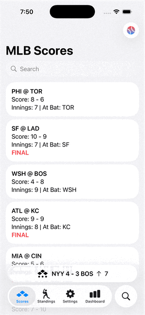
}Here, we’ve added a detent for when we just want to show the score of the game:
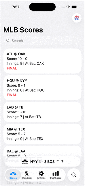
Selecting and Tracking Detents
You can even track the user’s chosen detent or programmatically adjust it with a binding:
.presentationDetents([.medium, .large],
                     selection: $currentDetent)
This lets you adapt your UI as interaction unfolds — imagine expanding your sheet when the user taps “Show Details”, or collapsing it after a confirmation. It also opens the door for subtle motion design: a medium sheet can transition seamlessly into a large one as more content loads or becomes available.
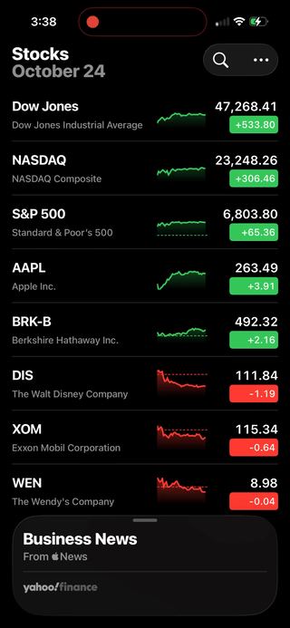
In Apple’s Stocks app, we see how tracking the selected detent actually determines the state of the content being shown. For instance, when it’s “closed”, the title says Business News, then changes the title to Top Stories in when set to the medium detent. And on large, the navigation bar transforms into a scrolling ticker.
This enables detents to be more than just a determination of how much/little of the background content is being shown, but also all the subtle states in and around it, as well.
Captain’s Tip
Think of detents like depth markers on a ship’s hull. Each one tells you how far your UI dives beneath the surface — a careful balance between immersion and intrusion. Use them to give your users buoyancy, not ballast.
Roles & Interactivity — Customizing Sheet Behavior
With detents you decide where a sheet lives. Now we’ll talk about how it behaves—how it interacts, how it dismisses, how it feels to tap, scroll, drag, or ignore the background behind it. These interactive modifiers turn sheets into living panels, not just pop-ups.
Background Interaction — The Layer Lives On
One of the biggest shifts in sheet behavior is what happens behind it. With .presentationBackgroundInteraction(_:), you decide whether the user can still interact with the view underneath.
.presentationBackgroundInteraction(.enabled(upThrough: .medium))Use this pattern when your sheet is part of a fluid interaction (e.g., a map panel). It lets users still tap and pan the map while the sheet sits at a lower detent. When the sheet expands, background interaction disables automatically—shifting focus naturally.
Appearance & Feel — Beyond Just Covering the Screen
Customization features like .presentationBackground(_:), .presentationCornerRadius(_:), and .presentationContentInteraction(_:) let you refine how the sheet looks and acts.
.sheet(isPresented: $showMenu) {
    MenuView()
        .presentationDetents([.height(250), .medium])
        .presentationBackground(.ultraThinMaterial)
        .presentationCornerRadius(24)
        .presentationContentInteraction(.scrolls)
}.presentationBackground(.ultraThinMaterial)gives that translucent glass feel..presentationCornerRadius(24)softens the sheet for modern presentation..presentationContentInteraction(.scrolls)helps where you have aScrollViewwithin your sheet, and you either want the scroll effect to have precedent or the drag-to-resize.
Dismissal Options — Different Ways of Letting Go
For when it’s time for sheet to sail off screen, we have a number of options to trigger and handle dismissing:
You can provide a more explicit control to dismiss a sheet by adding
Button(role: .close)to it’s toolbar.Use
.interactiveDismissDisabled(_:)to prevent the user from swiping away if your sheet requires completion (e.g., a payment flow).Use
@Environment(\.dismiss)inside the sheet content to dismiss programmatically.Provide an
onDismissclosure in the.sheet(...)to handle any logic that needs to happen once the sheet goes away (e.g. apply the settings the user chose on the sheet)
.sheet(isPresented: $showForm, onDismiss: { cleanUpForm() }) {
    FormView()
        .interactiveDismissDisabled(isProcessing)
}
This blend of intent, role, and behavior ensures the sheet aligns with your functional flow—whether it’s a quick glance, a control panel, or a committed task.
Captain’s Tip
Think of interactivity as sea state. A calm panel lets the waves (background) move; a deep dive sheet anchors the ship. Use these modifiers to control when the sea moves and when the ship settles.
Give Sheet a Try
Sheets used to be stop signs. Now, they’re flow points — a place where users can pause, peek, act, or dive deeper without ever leaving context. Sheet’s evolution to include detents, modifiers, and style controls turn what used to be a rigid pattern into something expressive and adaptive — a tool that matches the rhythm of your app, not break it’s vibe.
The real trick isn’t memorizing every modifier — it’s learning to feel when a sheet should expand, retract, scroll, or stay anchored. That’s what Apple’s evolving design language is all about: fluid layers that live together instead of on top of each other.
So experiment. Play. Let the sheet breathe with your design instead of boxing it in. Because in this new Liquid Glass era we’re all headed for, presentation isn’t interruption — it’s motion.
Great write-up, thanks for sharing this!
Really wish we had an auto-resizing detent option out of the box though.
I recently ran into an accessibility issue with VoiceOver where, when presenting a sheet, VO keeps reading the content behind the sheet. It’s pretty confusing for users with visual impairments. Would love to see Apple improve this behavior in future releases.