

Windowing on iPadOS (Or How I Learned to Love The Backlog Bomb)
The New Windowing System brings iPadOS even closer to macOS, but opens up a world of new development considerations

Another WWDC, another step closer to macOS and iPadOS merging. This year, it’s official: windowing has arrived on iPad — with resizable windows, top-left traffic lights, and full menu bar support.
For iPad users, this is certainly a welcomed change and brings about hope that, one day, the two platforms will truly become one (Where’s Xcode on iPad already?).
On the developer front, if you thought Liquid Glass was the biggest hit to your teams backlog this year, wait until you run your app through the Windowing system. If your app has multitasking enabled, your app is open to a number of potential new states to account for.
For pure iPad experiences, you may need to account for iPhone-sized scenarios (even if you’ve accounted for side-by-side)
For cross-platform apps, you could bring your iPhone experience to iPad
States could exist that are between iPad and iPhone (iPhone feel with iPad components) and could be previews of phone form factors to come
A new micro-state now exists
Turning MLB Tracker into an iPad App (Kinda)
To quickly convert MLB Tracker (my WWDC Demo app) to have an iPad Variant, I took advantage of ViewThatFits. This allowed me to do a few things:
Be able to switch between
NavigationSplitViewandNavigationStackWatch how and when iPadOS would decide to switch between split and stack
See if there were any in-between states
For both the Scores and Standings experiences, I used something like the following:
ViewThatFits {
    NavigationSplitView {
        SummaryTemplateView(
            ...
        )
    } detail: {
        GameDetailSheetView()
    }

    NavigationStack {
        SummaryTemplateView(
            ...
        )
    }
}
Simple, but enough to experiment with.
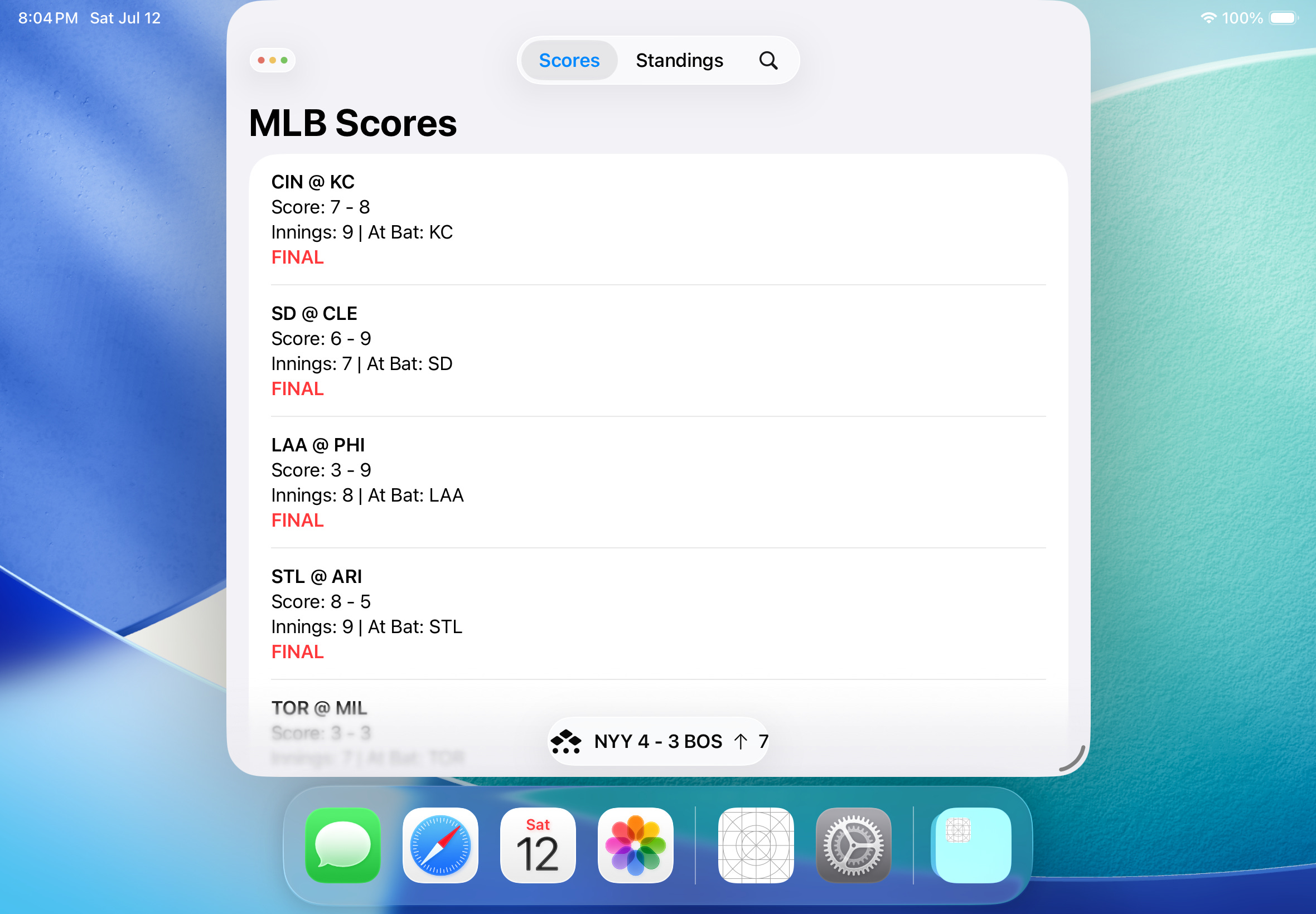
A Chronicle of Changes at Different Window Sizes
Overall, this is how MLB Tracker looks at various windowing states:
You’ll notice that there’s actually a few states as we scale the window size down. Unfortunately, scaling the size back up doesn’t automatically restore the larger state, either.
Here’s a breakdown of the various states.
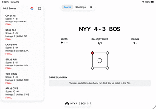
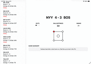
Portrait Full
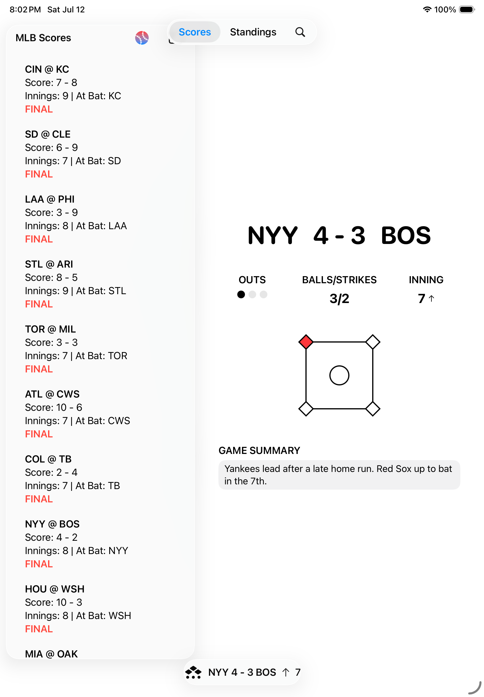
Landscape Full: iPad TabView / Split

Resized: iPad TabView / Switched to Stack
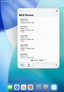
Resized More: iPhone TabView / Still Stack

Minimum Size: Smaller than iPhone SE

A New Micro-State
With window resizing comes the ability for users to create tiny windows with micro states. It’s something that isn’t quite a widget, but certainly goes smaller than your typical iPhone experience. The minimum size I found (running the iPad A16 simulator) was 375 x 486.

This could work for many experiences, but I would imagine there are some that already find it difficult to work on iPhone SE screens (568 x 320). That kind of micro-state might already break UI on an iPhone SE — and shrinking below that risks hiding essential UI or causing accessibility breakdowns.
Unfortunately, setting a minimum frame for a view does not seem to be respected. Here, I set a minimum height and width on my Content View and resizing completely breaks the experience:
And defaultSize and windowResizability don't really do anything.
Possible Micro-State Solution: Cover Page
If your experience really cannot work in certain frames, you could consider using a Cover Page to block access to the experience. Here, I state that whenever the window goes below a certain size (the SE dimensions), show a Text instead:
ViewThatFits {
    ContentView()
        .frame(minWidth: 320, maxWidth: .infinity, minHeight: 568, maxHeight: .infinity)

    Text("Please resize the window")
        .font(.headline)
}
The result gets the job done, but if your app allows for it then a more robust cover experience would certainly work, as well:
Prepare for Foldable iPhone Through Window Testing
Apple seems to be full steam ahead with releasing a foldable iPhone next year (production on the display for it has begun). The obvious scenario is that your app may exist on double the normal screen width. Using iPad's Windowing, we could probably emulate what this experience could look like (repost from above, but for contextual emphasis):

There's a chance split view could appear on the foldable (think landscape on a Pro Max), or perhaps a unique split view with a sidebar more appropriate for a foldable phone factor.
Embrace the Windows of Opportunity
Windowing for iPadOS really is the natural next step in the evolution of the platform. While it could certainly mean your development team has its work cut out for it to account for the new system, users will certainly appreciate it.
You can also look at windowing as fitting in with the new Liquid Glass design system. Think about how windows “fluidly” resize and how Apple would love for your experiences to “fluidly” adjust. In the updated Human Interface Guidelines, there are three new design principles: Hierarchy, Harmony, and Consistency. The latter states:
“Adopt platform conventions to maintain a consistent design that continuously adapts across window sizes and displays.” - Apple’s Human Interface Guidelines
That’s as straight-forward as it can get. We’re in the Liquid Glass era now: the sooner we embrace its principles, the better we can modernize our apps for our users!
Need help with Liquid Glass? Consider a Consultation with the Captain!