

Talking Liquid Glass with Apple
I spent three days talking Liquid Glass with Apple in NYC. Here’s what you need to know.

If you were developing for Apple platforms a decade ago, you probably remember the WWDC era in San Francisco. The massive scale, the live sessions, the sheer energy of thousands of developers packed into the Moscone Center—it was an incredible spectacle. But let’s be honest about the reality of the labs back then: you reserved a time slot, waited around while others got their questions answered, and grabbed whatever brief 1:1 time you could. It was grandiose, and information was largely being fed to you. It was rarely ever “intimate.”
Today, WWDC has evolved into a polished, pre-recorded cinematic event. While you can still go to Apple Park to meet with engineers, the loss of the week-long, in-person conference makes it a tough sell. For many companies and developers, it is incredibly hard to justify the investment of flying out just for a brief lab session.
But Apple has quietly built something else—something much more valuable for day-to-day engineering.
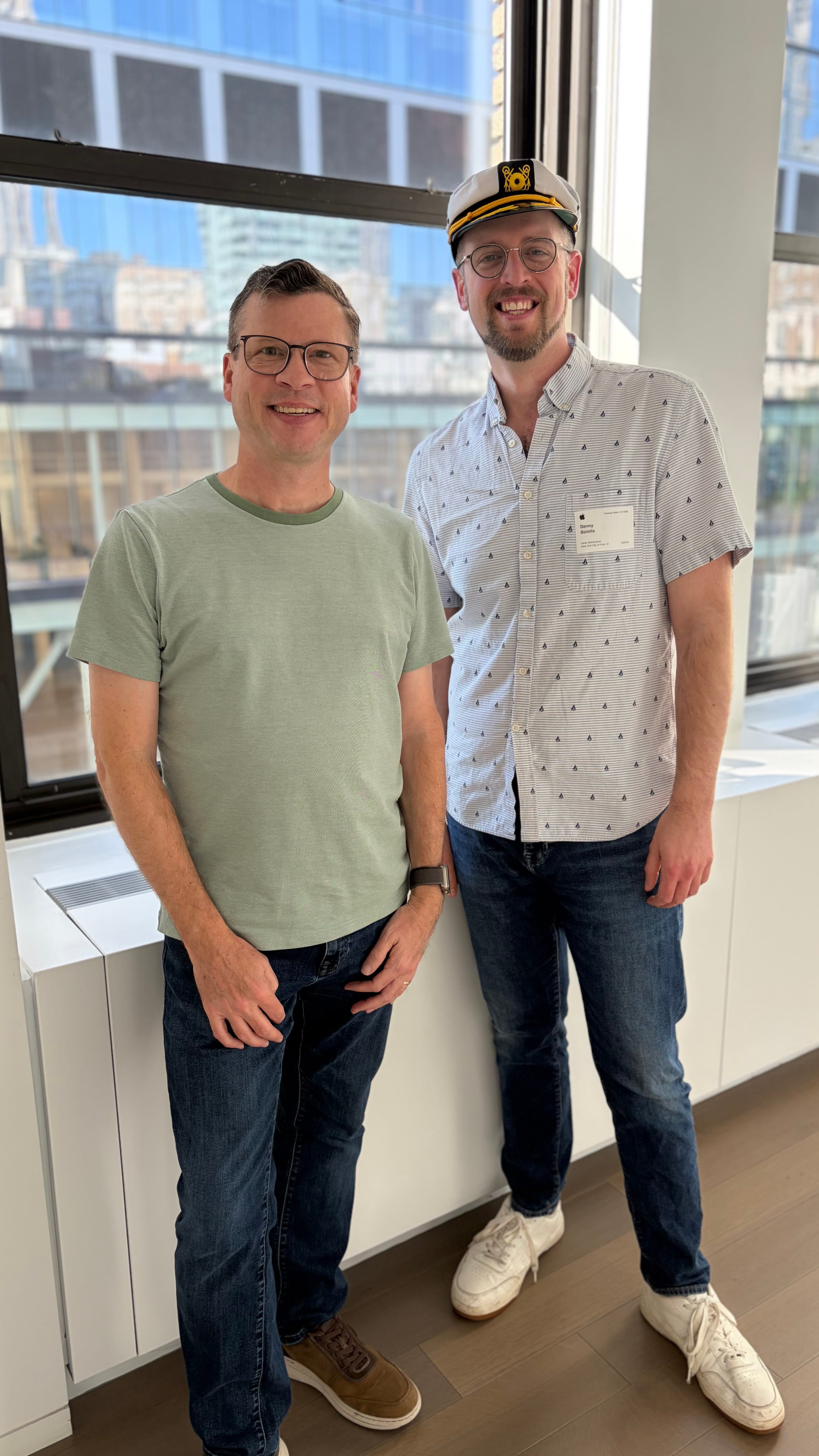
Recently, I had the privilege of attending the “Let’s talk Liquid Glass: New design workshop” at Apple’s offices in NYC. For three days, from 9 AM to 5 PM, I sat in a highly intimate room with Apple’s Developer Relations and Design Evangelists team. These were the folks tasked with knowing everything about Liquid Glass so they can travel the globe and help developers and designers actually use it (including one framework engineer in the room who specifically worked on SwiftUI).
They were incredibly accessible. I asked every question I could think of, got immediate feedback on lots of ideas and decisions, and worked through real-world implementation challenges for hours on end. It was the peak developer experience I had always hoped the old WWDC labs would be.
While I was there representing my team and can’t discuss the specific project details we worked on, there were certain philosophies and strategic insights I walked away with that absolutely apply to every single one of us.
Here are the universal lessons I learned from Apple’s Liquid Glass vanguard.
Universal Lesson 1: The Ship Has Sailed (Liquid Glass is Permanent)
Let’s address the elephant in the room. If you read the comments on my articles or browse the iOS subreddits, there is a vocal contingent of developers betting that Apple is going to roll back Liquid Glass.
The rationale usually points to the initial community backlash, the slower adoption rate of iOS 26, and the news that Alan Dye left Apple for Meta. The prevailing theory has been: “Just wait it out. They’ll revert to flat design.”
I shared this exact sentiment with the Apple team.
Their reaction? Genuine shock. They were actually concerned that developers were holding onto this position. They made it emphatically clear that Liquid Glass is absolutely moving forward, evolving, and expanding across the ecosystem.
Their exact warning to me was that those who don’t adopt it now “are gonna find themselves in a tough position later.”
During the workshop, they admitted they have seen teams who are only interested in doing the bare minimum—just enough to keep their app from breaking when the new system is forced on. While that is technically allowed, it is a dangerous game of technical debt.
We had them confirm the hard truth: Xcode 27 will absolutely not have the deferral flag, and it will not respect it if you leave it there, anyway. When Q1 2027 rolls around and Xcode 27 becomes the mandatory minimum for compiling to the App Store, glass will be enabled globally, period.
If you are waiting for a rollback, you are charting a course for a shipwreck. It’s time to accept and get into the new system.
Universal Lesson 2: Hierarchy is the Anchor (Content is King, Controls are Servants)
If you read my previous article, The Northern Stars of Liquid Glass, you know the Apple HIG dictates three core design principles for this new era: hierarchy, harmony, and consistency.
But if you want to know what Apple really cares about people focusing on? It’s hierarchy.
Hierarchy wasn’t just a bullet point; it was the absolute anchor for the entire three-day session. The Apple designers relentlessly emphasized the need to strictly break every screen down into two distinct dimensions: the content layer and the control layer.
Here is the harsh truth that many developers (and designers) struggle to accept: nobody opens your app to admire your custom buttons. They open it for the content. Because the content is the ultimate destination, it should be given as much screen real-estate as physically possible.
To achieve this, your control layer needs to get out of the way. Apple stressed pushing controls to “prime real-estate” locations—specifically the vertical extremes of the screen, like the top navigation bar and/or the bottom toolbar and TabView.
The rule of thumb they drove home applies across every single Apple platform: Controls serve the content.
If a UI element sits in one of those prime locations, its sole purpose must be to facilitate the user’s interaction with the bedrock content in the center of the screen. If it doesn’t serve the content, it’s just visual clutter taking up valuable space.
I plan to share an article soon where I break down the exact physics, z-axis rules, and “Barbell Layouts” of this hierarchy. But the high-level takeaway from the NYC labs is crystal clear: maximize your content, push your controls to the poles, and never let the interface compete with the information.
Universal Lesson 3: The Great Reset (and the Promise of WWDC26)
I have seen the comments on my posts, and I’ve read the threads on Reddit and developer forums. There is a lot of frustration out there about the loss of customizable properties and missing sub-elements in some of the new Liquid Glass components. You feel like your toolkit shrank overnight.
I brought this up directly with the Apple team. The good news? They are completely aware of it.
They explained that what we are experiencing right now is the exact same phenomenon that happened during the last massive design shift: the move to iOS 7. We just spent over a decade building on a design system that had time to fully evolve and mature from iOS 7 all the way through iOS 18. We had every modifier and customization hook we could ever want.
Now, we are living through a reset. We are back at Version 1.0.
The Apple engineers explained that a massive part of the initial Liquid Glass rollout was simply ensuring the foundation was solid. It had to be functional, it had to meet incredibly strict styling guidelines across every single Apple platform, and most importantly, it just had to work. When you are rebuilding the visual physics of an entire OS ecosystem, deep component customization takes a back seat to foundational stability.
But here is where it gets exciting.
The team was visibly enthusiastic about what is in store for WWDC26 and Xcode 27. While they wouldn’t drop any specific spoilers, they gave the very strong impression that this upcoming cycle is where Liquid Glass takes its first massive step into maturity.
Seeing their level of historical awareness regarding the iOS 7 transition—and their genuine excitement for what’s next—left me incredibly optimistic. The foundation is poured; now, they are getting ready to decorate the house.
Universal Lesson 4: Stop Fighting the Framework (SwiftUI Best Practices)
Beyond the overarching design principles of Liquid Glass, the Apple engineers dropped some incredibly practical, day-to-day SwiftUI advice. If you want to build robust, modern apps, here are three architectural course corrections straight from the source:
1. The List vs. ScrollView Reality Check - Many of us have been defaulting to List the second we need a scrolling column of data. The team made a point to clarify that List should really be reserved for highly specific, uniform data structures, or when you absolutely need built-in swipe actions. For almost everything else? You should be reaching for a ScrollView paired with a LazyVStack or LazyHStack. Between the massive improvements to ScrollView over the last few years and the inherent flexibility and performance of Lazy Stacks, rolling your own scrolling layout gives you far greater control over your styling—which is helpful when trying to nail the Liquid Glass look.
2. The Untapped Power of Custom Containers - They gently reminded us that we have the API to create our own custom containers in SwiftUI. Honestly, this felt like a massive missed opportunity for the community. It is a topic I rarely see covered by other iOS writers or utilized in the open-source repos I review. Instead of hacking a generic VStack with a dozen modifiers to act like a specific container, take the time to build a custom one. It makes your call sites significantly cleaner and your intent much clearer.
3. Ride the Native Wave (and Style It) - Especially now, while the maturity of the design system has been “reset,” the absolute best thing you can do is stick to native components. If you build a completely custom button or toggle from scratch using raw shapes, your app could get stuck in the past when Apple inevitably rolls out the next waves of Liquid Glass enhancements. Sticking with native components ensures your app naturally rides along with the OS’s evolution.
They took it a step further: when you need varying forms of a component, do not rebuild it. That is exactly what Styles are for. I touched on this heavily in my recent article on FULL DISCLOSUREgroup, and hearing Apple echo this sentiment validated that approach. Keep the native structural integrity and functional purpose, and use the Style protocols to paint the glass.
The Call to Action: Get in the Room
Attending WWDC 2016 in San Francisco was a milestone in my career, but spending three days in a quiet room with Apple’s design evangelists and framework engineers was entirely different. It wasn’t a spectacle; it was about the craft.
It is incredibly easy to sit behind our keyboards, read documentation, and complain online when an API doesn’t work exactly the way we want it to. But when you have 9-to-5 access to the team whose entire job is to know this system inside and out, you realize they are deeply passionate about this platform, they hear our feedback, and they are building for a multi-year horizon.
If you ever get the opportunity to attend one of these Liquid Glass or similar sessions—whether it’s in NYC, Cupertino, London, Tokyo, or elsewhere—go.
With the traditional week-long WWDC conference gone, these localized workshops are the absolute best way to get face-to-face time with Apple. Keep a close eye on the Apple Developer app and website for upcoming design labs. Pitch your company on the ROI of sending you to attend these sessions. The ability to bring your actual codebase, sit down with Apple for three full days, and get unscripted, immediate feedback is unparalleled. It will make you a better engineer, and it will give you a profound understanding of where the wind is blowing in the ecosystem.
And just in case you need to read it one more time: Liquid Glass is here. It’s time to learn how to sail it.
Navigate the Liquid Glass Transition with The Captain
The Xcode 27 deadline is approaching, and as the Apple engineers confirmed, there is no deferral flag. You don’t have to figure out this design reset alone. I have spent most of the last year leading Liquid Glass adoptions, and after my recent three-day intensive at the Apple Developer Center in NYC, I am offering expert-level, 1-on-1 consulting to get your app’s architecture ready for the new era.
Whether you need a UI/UX conflict teardown, custom container strategies, or a session to fix your control/content hierarchy, we can map it out.
Fighting the system usually slows you down more than it helps.
The scale and polish increased, but the depth of interaction changed. Sometimes the most valuable part of these events was the unplanned, human connection.